Featured collection
Overview
Displays products from up to 10 selected collections in a grid or slideshow layout. Section settings cover the header (tagline, heading, description, view-all button), tab label typography, card presentation (image ratio, typography, price, vendor, tags, ATC button, swatches), grid and slideshow controls, layout container, color scheme, and spacing. This section has no blocks — all configuration is done at the section level.
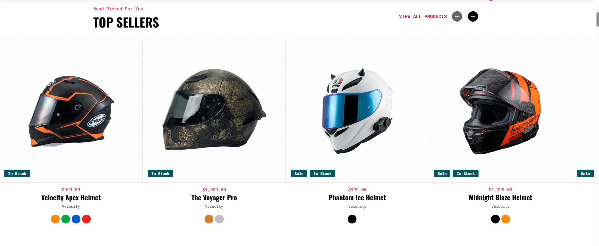
Section Configuration
Collections
| Setting |
Description |
| Collections |
Selects up to 10 Shopify collections to display. Each collection becomes a tab. |
| Setting |
Description |
| Tagline |
Short text above the heading. Default: "Add a tagline". |
| Tagline Size |
Large, Medium, or Small. Default: Medium. |
| Tagline Weight |
Thin (100) to Black (900). Default: Normal (400). |
| Tagline Case |
None, Uppercase, Capitalize, or Lowercase. Default: Capitalize. |
| Tagline Font Family |
Default or Heading font. |
| Tagline Color Style |
Default, Heading, or Body color preset. |
Heading
| Setting |
Description |
| Heading |
Main section heading. Supports inline rich text. Default: "Featured collection". |
| Heading Size |
H1–H6 or Large, Medium, Small. Default: H3. |
| Heading Weight |
Thin (100) to Black (900). Default: Bold (700). |
| Heading Case |
None, Uppercase, Capitalize, or Lowercase. Default: Uppercase. |
| Heading Tag |
Semantic HTML heading level (H1–H6). Default: H2. |
| Heading Font Family |
Default or Body font. |
| Heading Color Style |
Default or Body color preset. |
| Heading Link Style |
Default or Link style when heading contains a hyperlink. |
| Setting |
Description |
| Show View All Button |
Toggles the collection link button. Enabled by default. |
| Button Label |
Button text. Default: "View all". Visible when button is enabled. |
| Button Type |
Primary, Secondary, Styled, or Link (underlined). Default: Link. Visible when button is enabled. |
| Button Case |
None, Uppercase, Capitalize, or Lowercase. Default: Uppercase. Visible when button is enabled. |
| Open in New Tab |
Opens the collection link in a new tab. Visible when button is enabled. |
| Button Position |
Where the button appears: Default (below content), Below Header, or Inline Header. Default: Inline Header. Visible when button is enabled. |
| Setting |
Description |
| Header Margin – Desktop |
Bottom spacing between header and product content on desktop. Range: 0–100 px, default 35 px. |
| Header Margin – Mobile |
Bottom spacing between header and product content on mobile. Range: 0–100 px, default 15 px. |
Tabset Settings
Typography applied to collection tab labels.
| Setting |
Description |
| Tab Text Size |
Large, Medium, or Small. Default: Medium. |
| Tab Text Weight |
Thin (100) to Black (900). Default: Normal (400). |
| Tab Text Case |
None, Uppercase, Capitalize, or Lowercase. Default: Capitalize. |
| Tab Font Family |
Default or Heading font. |
Card Settings
| Setting |
Description |
| Media Ratio |
Product image aspect ratio: Adapt (original), Square, Portrait, or Fit to Box. Default: Adapt. |
| Desktop Card Height |
Fixed card image height on desktop. Range: 100–400 px, default 265 px. Visible only when Media Ratio is Fit to Box. |
| Mobile Card Height |
Fixed card image height on mobile. Range: 100–400 px, default 265 px. Visible only when Media Ratio is Fit to Box. |
| Second Image on Hover |
Shows the product's second image when hovered. Enabled by default. |
Card Heading
| Setting |
Description |
| Card Heading Size |
H4–H6 or Large, Medium, Small. Default: H5. |
| Card Heading Weight |
Thin (100) to Black (900). Default: Bold (700). |
| Card Heading Case |
None, Uppercase, Capitalize, or Lowercase. Default: Capitalize. |
| Card Heading Tag |
Semantic HTML heading level (H1–H6). Default: H3. |
| Card Heading Font Family |
Default or Body font. |
| Card Heading Color Style |
Default or Body color preset. |
Price
| Setting |
Description |
| Show Price |
Toggles product price display. Enabled by default. |
| Price Size |
Large, Medium, or Small. Default: Medium. Visible when price is shown. |
| Price Weight |
Thin (100) to Black (900). Default: Normal (400). Visible when price is shown. |
| Price Case |
None, Uppercase, Capitalize, or Lowercase. Default: Capitalize. Visible when price is shown. |
| Price Font Family |
Default or Heading font. Visible when price is shown. |
| Price Color Style |
Default, Heading, or Body color preset. Visible when price is shown. |
Unit Price
| Setting |
Description |
| Show Unit Price |
Toggles unit pricing display. Enabled by default. |
| Unit Price Size |
Large, Medium, or Small. Default: Small. Visible when unit price is shown. |
| Unit Price Weight |
Thin (100) to Black (900). Default: Normal (400). Visible when unit price is shown. |
| Unit Price Case |
None, Uppercase, Capitalize, or Lowercase. Default: Capitalize. Visible when unit price is shown. |
| Unit Price Font Family |
Default or Heading font. Visible when unit price is shown. |
| Unit Price Color Style |
Heading or Body color preset. Default: Body. Visible when unit price is shown. |
Vendor
| Setting |
Description |
| Show Vendor |
Toggles product vendor display. Enabled by default. |
| Vendor Size |
Large, Medium, or Small. Default: Small. Visible when vendor is shown. |
| Vendor Weight |
Thin (100) to Black (900). Default: Normal (400). Visible when vendor is shown. |
| Vendor Case |
None, Uppercase, Capitalize, or Lowercase. Default: Capitalize. Visible when vendor is shown. |
| Vendor Font Family |
Default or Heading font. Visible when vendor is shown. |
| Vendor Color Style |
Heading or Body color preset. Default: Body. Visible when vendor is shown. |
| Setting |
Description |
| Show Tags |
Toggles all product tag badges. Enabled by default. |
| Show Custom Tag |
Displays custom product tags. Visible when tags are enabled. |
| Show Sale Tag |
Displays a sale badge on discounted products. Visible when tags are enabled. |
| Show Stock Tag |
Displays a low/out-of-stock badge. Visible when tags are enabled. |
| Tag Position |
Badge placement: Top Left, Top Right, or Bottom. Default: Bottom. Visible when tags are enabled. |
| Setting |
Description |
| Enable Add to Cart |
Toggles the ATC button on product cards. Enabled by default. |
| ATC Button Type |
Primary, Secondary, Styled, or Link (underlined). Default: Styled. Visible when ATC is enabled. |
| ATC Button Case |
None, Uppercase, Capitalize, or Lowercase. Default: Uppercase. Visible when ATC is enabled. |
Swatches
| Setting |
Description |
| Show Swatches |
Toggles variant swatches on product cards. Enabled by default. |
| Swatches Position |
First (above card info) or Last (below card info). Default: Last. Visible when swatches are enabled. |
| Swatches Style |
Square or Circle. Default: Circle. Visible when swatches are enabled and variant layout is active. |
Card Alignment
| Setting |
Description |
| Desktop Text Alignment |
Text alignment on card content on desktop. Default: Center. |
| Mobile Text Alignment |
Text alignment on card content on mobile. Default: Center. |
Grid Settings
| Setting |
Description |
| Desktop Columns |
Number of product columns on desktop. Range: 2–4, default 3. |
| Max Products |
Maximum number of products shown. Range: 4–24, default 8. |
| Mobile Columns |
Number of product columns on mobile: 1 or 2. Default: 2. |
| Desktop Grid Spacing |
Gap between product cards on desktop. Range: 0–100 px, default 0 px. |
| Mobile Grid Spacing |
Gap between product cards on mobile. Range: 0–100 px, default 0 px. |
Slideshow Settings
| Setting |
Description |
| Show Arrows |
Enables navigation arrows. Enabled by default. |
| Arrows Position |
Placement of navigation arrows: Default, Inline Header, Space Between Header, or Contained. Default: Inline Header. |
| Autoplay |
Auto-advances through collection tabs. Disabled by default. |
| Slide Change Interval |
Delay between automatic transitions. Range: 2000–9000 ms, default 5000 ms. |
Layout Settings
| Setting |
Description |
| Layout Style |
Product display mode: Grid or Slideshow. Default: Slideshow. |
| Container Layout |
Page Width, Contained Content, or Container Fluid. Default: Contained Content. |
| Border Style |
None, Top, Bottom, or Top & Bottom. Visible when not Page Width. Default: Top & Bottom. |
| Container Size |
Max container width as a percentage of page width. Range: 50–100%, default 100%. |
| Desktop Text Alignment |
Header text alignment on desktop. Default: Left. |
| Mobile Text Alignment |
Header text alignment on mobile. Default: Left. |
| Color Scheme |
Shopify color scheme applied to the section. Default: Scheme 1. |
