Collection list
Overview
Displays a vertical list of collection cards, each linking to a Shopify collection with a custom image, optional backdrop text, a description, and a call-to-action button. An optional animated shader gradient can be applied per card. Section settings cover the header (tagline, heading, description, view-all button), card typography (heading, product count, body text, button), card spacing, layout container, color scheme, and spacing. Collection blocks are added to build the list.
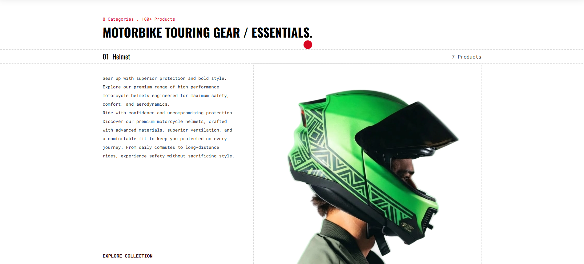
Section Configuration
Tagline
| Setting |
Description |
| Tagline |
Short text above the heading. Default: "Add a tagline". |
| Tagline Size |
Large, Medium, or Small. Default: Medium. |
| Tagline Weight |
Thin (100) to Black (900). Default: Normal (400). |
| Tagline Case |
None, Uppercase, Capitalize, or Lowercase. Default: Capitalize. |
| Tagline Font Family |
Default or Heading font. |
| Tagline Color Style |
Default, Heading, or Body color preset. |
Heading
| Setting |
Description |
| Heading |
Main section heading. Supports inline rich text. Default: "Talk about your brand". |
| Heading Size |
H1–H6 or Large, Medium, Small. Default: H3. |
| Heading Weight |
Thin (100) to Black (900). Default: Bold (700). |
| Heading Case |
None, Uppercase, Capitalize, or Lowercase. Default: Uppercase. |
| Heading Tag |
Semantic HTML heading level (H1–H6). Default: H2. |
| Heading Font Family |
Default or Body font. |
| Heading Color Style |
Default or Body color preset. |
| Heading Link Style |
Default or Link style when heading contains a hyperlink. |
Description
| Setting |
Description |
| Description |
Rich-text content below the heading. |
| Text Size |
Large, Medium, or Small. Default: Large. |
| Text Weight |
Thin (100) to Black (900). Default: Normal (400). |
| Text Case |
None, Uppercase, Capitalize, or Lowercase. Default: None. |
| Text Font Family |
Default or Heading font. |
| Text Color Style |
Default or Heading color preset. |
| Setting |
Description |
| Button Label |
Button text. Default: "Button label". |
| Button Link |
URL the button navigates to. |
| Button Type |
Primary, Secondary, Styled, or Link (underlined). Default: Styled. |
| Button Case |
None, Uppercase, Capitalize, or Lowercase. Default: Uppercase. |
| Open in New Tab |
Opens the button link in a new tab. Disabled by default. |
| Button Position |
Where the button appears: Default (below content), Inline Header, or Below Header. Default: Default. |
| Setting |
Description |
| Header Margin – Desktop |
Bottom spacing between header and cards on desktop. Range: 0–100 px, default 35 px. |
| Header Margin – Mobile |
Bottom spacing between header and cards on mobile. Range: 0–100 px, default 15 px. |
Card Settings
| Setting |
Description |
| Fit to Box |
Crops card images to a fixed height instead of adapting to their natural ratio. Disabled by default. |
Card Heading
| Setting |
Description |
| Card Heading Size |
H1–H6 or Large, Medium, Small. Default: H5. |
| Card Heading Weight |
Thin (100) to Black (900). Default: Normal (400). |
| Card Heading Case |
None, Uppercase, Capitalize, or Lowercase. Default: Capitalize. |
| Card Heading Tag |
Semantic HTML heading level (H1–H6). Default: H3. |
| Card Heading Font Family |
Default or Body font. |
| Card Heading Color Style |
Default or Body color preset. |
Card Count
Typography applied to the product count displayed on each collection card.
| Setting |
Description |
| Count Size |
Large, Medium, or Small. Default: Large. |
| Count Weight |
Thin (100) to Black (900). Default: Normal (400). |
| Count Case |
None, Uppercase, Capitalize, or Lowercase. Default: Capitalize. |
| Count Font Family |
Default or Heading font. |
| Count Color Style |
Default or Heading color preset. |
Card Text
| Setting |
Description |
| Card Text Size |
Large, Medium, or Small. Default: Medium. |
| Card Text Weight |
Thin (100) to Black (900). Default: Normal (400). |
| Card Text Case |
None, Uppercase, Capitalize, or Lowercase. Default: None. |
| Card Text Font Family |
Default or Heading font. |
| Card Text Color Style |
Default or Heading color preset. |
| Setting |
Description |
| Card Button Type |
Primary, Secondary, Styled, or Link (underlined). Default: Link. |
| Card Button Case |
None, Uppercase, Capitalize, or Lowercase. Default: Uppercase. |
| Open in New Tab |
Opens card button links in a new tab. Disabled by default. |
Card Spacing
| Setting |
Description |
| Desktop Grid Spacing |
Gap between collection cards on desktop. Range: 0–100 px, default 88 px. |
Layout Settings
| Setting |
Description |
| Enable Stack Animation |
Animates cards with a stacking scroll effect as the section enters the viewport. Enabled by default. |
| Container Layout |
Page Width, Contained Content, or Container Fluid. Default: Contained Content. |
| Border Style |
None, Top, Bottom, or Top & Bottom. Visible when not Page Width. Default: None. |
| Container Size |
Max container width as a percentage of page width. Range: 50–100%, default 100%. |
| Desktop Text Alignment |
Header text alignment on desktop. Default: Left. |
| Mobile Text Alignment |
Header text alignment on mobile. Default: Left. |
| Color Scheme |
Shopify color scheme applied to the section. Default: Scheme 1. |
