Promotion banner
Overview
The Promotion Banner section allows merchants to display one or more full-bleed banner blocks in a configurable grid layout, each independently supporting a background video , a desktop and mobile image with gradient overlay, an optional logo, and a full content stack including tagline, heading, richtext description, and a call-to-action button. Every banner block exposes granular typography controls size, weight, case, font family, and color preset for each content element, as well as independent vertical content alignment, caption width, grid position, and text alignment on desktop and mobile. Section-level settings govern the overall banner height, grid spacing between blocks, container layout, color scheme, and all inner and outer spacing.
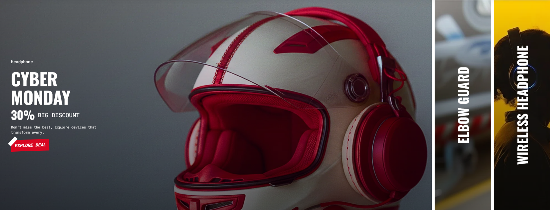
Banner Block Configuration
Each banner block added to the section represents one individual promotional panel. The block is divided into media settings, content settings, and block-level layout settings.
| Setting |
Description |
| Video |
Selects a Shopify-hosted video to use as the banner background. |
| Embed Video |
Accepts a YouTube or Vimeo URL to use as an embedded video background. |
| Video Alt Text |
Provides accessible alternative text for the background video. Defaults to "Describe your video". |
| Image |
Selects a background image for the banner on desktop. |
| Overlay |
Applies a color or gradient overlay on top of the desktop background image or video. Defaults to a bottom-darkening black gradient. |
| Mobile Image |
Selects an alternative background image displayed on mobile devices. |
| Mobile Overlay |
Applies a separate color or gradient overlay for the mobile background. Defaults to the same bottom-darkening black gradient. |
| Logo |
Selects an optional logo image displayed within the banner content area. |
| Logo Size |
Controls the width of the logo image. Range: 30–300 px, default 120 px. |
| Show Image |
Toggles whether the background image is visible. Enabled by default. |
Content Settings
Tagline
| Setting |
Description |
| Tagline |
Adds a short introductory text displayed above or below the main heading, depending on the Tagline Position setting. |
| Tagline Size |
Controls the tagline text size: Large, Medium, or Small. |
| Tagline Weight |
Controls the font weight of the tagline from Thin (100) to Black (900). |
| Tagline Case |
Controls text casing: None, Uppercase, Capitalize, or Lowercase. Defaults to Capitalize. |
| Tagline Font Family |
Selects the font family for the tagline: Default or Heading font. |
| Tagline Color Style |
Applies a predefined color preset to the tagline: Default, Heading, or Body. |
| Tagline Position |
Controls whether the tagline appears before (First) or after (Second) the heading. Defaults to First. |
Heading
| Setting |
Description |
| Heading |
Defines the main heading of the banner. Supports inline rich text. Defaults to "Banner". |
| Heading Size |
Controls the heading size: H1–H6 or Large, Medium, and Small text sizes. Defaults to H1. |
| Heading Tag |
Defines the semantic HTML heading level rendered in the DOM, from H1 to H6. Defaults to H2. |
| Heading Weight |
Controls the heading font weight from Thin (100) to Black (900). Defaults to Bold (700). |
| Heading Case |
Controls heading text casing: None, Uppercase, Capitalize, or Lowercase. Defaults to Uppercase. |
| Heading Font Family |
Selects the heading font family: Default or Body font. |
| Heading Color Style |
Applies a predefined color preset to the heading: Default or Body. |
| Heading Link Style |
Defines the link styling applied when the heading contains a hyperlink: Default or Link. |
| Setting |
Description |
| Button Label |
Sets the visible text label of the call-to-action button. Defaults to "Button label". |
| Button Link |
Sets the URL the button navigates to when clicked. |
| Button Type |
Defines the visual preset style of the button: Primary, Secondary, Styled, or Link (underlined). Defaults to Styled. |
| Button Case |
Controls the button label text casing: None, Uppercase, Capitalize, or Lowercase. Defaults to Uppercase. |
| Open in New Tab |
When enabled, the button link opens in a new browser tab. Disabled by default. |
Block Layout Settings
| Setting |
Description |
| Desktop Content Alignment |
Controls the vertical positioning of the content stack within the banner on desktop: Top, Middle, or Bottom. Defaults to Middle. |
| Mobile Content Alignment |
Controls the vertical positioning of the content stack within the banner on mobile: Top, Middle, or Bottom. Defaults to Middle. |
| Desktop Caption Size |
Controls the maximum width of the content caption area on desktop as a percentage of the banner width. Range: 20–100%, default 100%. |
| Mobile Caption Size |
Controls the maximum width of the content caption area on mobile as a percentage of the banner width. Range: 20–100%, default 100%. |
| Desktop Columns |
Sets how many grid columns this banner block spans on desktop. Range: 1–6, default 3. |
| Desktop Rows |
Sets how many grid rows this banner block spans on desktop. Range: 1–4, default 1. |
| Mobile Columns |
Sets how many grid columns this banner block spans on mobile. Range: 1–6, default 1. |
| Mobile Rows |
Sets how many grid rows this banner block spans on mobile. Range: 1–4, default 1. |
| Desktop Text Alignment |
Controls the horizontal alignment of all text content within the banner on desktop. Defaults to Center. |
| Mobile Text Alignment |
Controls the horizontal alignment of all text content within the banner on mobile. Defaults to Center. |
| Color Scheme |
Applies a predefined Shopify theme color scheme to the individual banner block. Defaults to Scheme 3. |
Section Configuration
| Setting |
Description |
| Desktop Height |
Controls the fixed height of the banner section on desktop. Range: 350–598 px, default 574 px. |
| Mobile Height |
Controls the fixed height of the banner section on mobile. Range: 250–400 px, default 385 px. |
Grid Settings
These settings control the spacing between banner blocks when multiple banners are displayed together.
| Setting |
Description |
| Desktop Grid Spacing |
Controls the gap between banner blocks on desktop. Range: 0–100 px, default 10 px. |
| Mobile Grid Spacing |
Controls the gap between banner blocks on mobile. Range: 0–100 px, default 10 px. |
Layout Settings
| Setting |
Description |
| Container Layout |
Defines the section's horizontal layout behaviour: Page Width, Contained Content, or Container Fluid. Defaults to Container Fluid. |
| Border Style |
Adds an optional border to the section: None, Top, Bottom, or Top & Bottom. This setting is available when the Page Width container layout is not selected. Defaults to None. |
| Container Size |
Controls the maximum desktop container width as a percentage of the available page width. Range: 50–100%, default 100%. |
| Color Scheme |
Applies a predefined Shopify theme color scheme to the overall section. Defaults to Scheme 1. |
Inner Spacing
Controls the padding inside the section container.
| Setting |
Description |
| Desktop Top Padding |
Controls internal spacing at the top of the section on desktop. Default 60 px. |
| Desktop Bottom Padding |
Controls internal spacing at the bottom of the section on desktop. Default 60 px. |
| Desktop Left Padding |
Controls internal left spacing on desktop. Default 0 px. |
| Desktop Right Padding |
Controls internal right spacing on desktop. Default 0 px. |
| Mobile Top Padding |
Controls internal top spacing on mobile. Default 35 px. |
| Mobile Bottom Padding |
Controls internal bottom spacing on mobile. Default 35 px. |
| Mobile Left Padding |
Controls internal left spacing on mobile. Default 0 px. |
| Mobile Right Padding |
Controls internal right spacing on mobile. Default 0 px. |
Outer Spacing
Controls the margin outside the section container.
| Setting |
Description |
| Desktop Top Spacing |
Controls the space above the section on desktop. Default 0 px. |
| Desktop Bottom Spacing |
Controls the space below the section on desktop. Default 0 px. |
| Desktop Left Spacing |
Controls external left spacing on desktop. Default 0 px. |
| Desktop Right Spacing |
Controls external right spacing on desktop. Default 0 px. |
| Mobile Top Spacing |
Controls the space above the section on mobile. Default 0 px. |
| Mobile Bottom Spacing |
Controls the space below the section on mobile. Default 0 px. |
| Mobile Left Spacing |
Controls external left spacing on mobile. Default 0 px. |
| Mobile Right Spacing |
Controls external right spacing on mobile. Default 0 px. |
