Image gallery
Overview
Displays a grid or slideshow of image cards, each with a custom overlay, heading, description, and independent color scheme. An optional section-level header (tagline, heading, description, view-all button) appears above the gallery. Section settings cover header typography, card typography and alignment, grid and slideshow controls, layout container, color scheme, and spacing. Image blocks are added to populate the gallery.
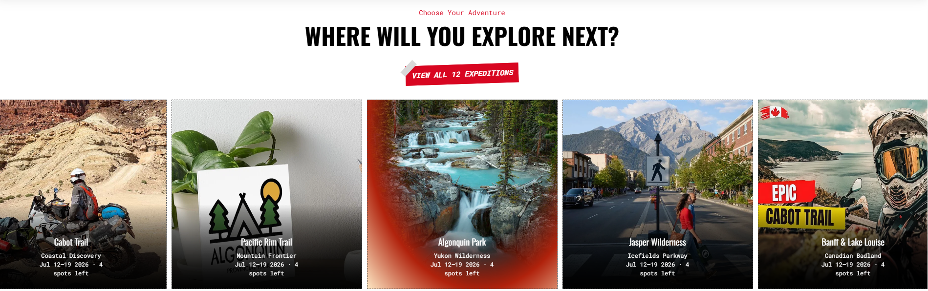
Section Configuration
Tagline
| Setting |
Description |
| Tagline |
Short text above the heading. Default: "Add a tagline". |
| Tagline Size |
Large, Medium, or Small. Default: Medium. |
| Tagline Weight |
Thin (100) to Black (900). Default: Normal (400). |
| Tagline Case |
None, Uppercase, Capitalize, or Lowercase. Default: Capitalize. |
| Tagline Font Family |
Default or Heading font. |
| Tagline Color Style |
Default, Heading, or Body color preset. |
Heading
| Setting |
Description |
| Heading |
Main section heading. Supports inline rich text. Default: "Images gallery". |
| Heading Size |
H1–H6 or Large, Medium, Small. Default: H2. |
| Heading Weight |
Thin (100) to Black (900). Default: Bold (700). |
| Heading Case |
None, Uppercase, Capitalize, or Lowercase. Default: Uppercase. |
| Heading Tag |
Semantic HTML heading level (H1–H6). Default: H2. |
| Heading Font Family |
Default or Body font. |
| Heading Color Style |
Default or Body color preset. |
| Heading Link Style |
Default or Link style when heading contains a hyperlink. |
Description
| Setting |
Description |
| Description |
Rich-text content below the heading. |
| Text Size |
Large, Medium, or Small. Default: Large. |
| Text Weight |
Thin (100) to Black (900). Default: Normal (400). |
| Text Case |
None, Uppercase, Capitalize, or Lowercase. Default: None. |
| Text Font Family |
Default or Heading font. |
| Text Color Style |
Default or Heading color preset. |
| Setting |
Description |
| Button Label |
Button text. Default: "Button label". |
| Button Link |
URL the button navigates to. |
| Button Type |
Primary, Secondary, Styled, or Link (underlined). Default: Styled. |
| Button Case |
None, Uppercase, Capitalize, or Lowercase. Default: Uppercase. |
| Open in New Tab |
Opens the button link in a new tab. Disabled by default. |
| Setting |
Description |
| Header Margin – Desktop |
Bottom spacing between header and gallery on desktop. Range: 0–100 px, default 32 px. |
| Header Margin – Mobile |
Bottom spacing between header and gallery on mobile. Range: 0–100 px, default 15 px. |
Card Settings
Card Heading
| Setting |
Description |
| Image Size |
Fixed width of each gallery card. Range: 250–500 px, default 390 px. |
| Card Heading Size |
H6, Large, Medium, or Small. Default: H6. |
| Card Heading Weight |
Thin (100) to Black (900). Default: Normal (400). |
| Card Heading Case |
None, Uppercase, Capitalize, or Lowercase. Default: Capitalize. |
| Card Heading Tag |
Semantic HTML heading level (H1–H6). Default: H3. |
| Card Heading Font Family |
Default or Body font. |
| Card Heading Color Style |
Default or Body color preset. |
| Card Heading Link Style |
Default or Link style when heading contains a hyperlink. Default: Link. |
Card Text
| Setting |
Description |
| Card Text Size |
Large, Medium, or Small. Default: Small. |
| Card Text Weight |
Thin (100) to Black (900). Default: Normal (400). |
| Card Text Case |
None, Uppercase, Capitalize, or Lowercase. Default: None. |
| Card Text Font Family |
Default or Heading font. |
| Card Text Color Style |
Default or Heading color preset. Default: Heading. |
Card Alignment
| Setting |
Description |
| Content Vertical Alignment |
Vertical position of content within the card: Top, Middle, or Bottom. Default: Bottom. |
| Desktop Text Alignment |
Card content alignment on desktop. Default: Center. |
| Mobile Text Alignment |
Card content alignment on mobile. Default: Center. |
Grid Settings
| Setting |
Description |
| Desktop Grid Spacing |
Gap between cards on desktop. Range: 0–100 px, default 10 px. |
| Mobile Grid Spacing |
Gap between cards on mobile. Range: 0–100 px, default 10 px. |
Slideshow Settings
| Setting |
Description |
| Show Arrows |
Enables navigation arrows on the slideshow. Enabled by default. |
| Arrow Button Type |
Visual style of arrow buttons: Primary, Secondary, or Link. Default: Secondary. Visible when arrows are enabled. |
| Autoplay |
Auto-advances through gallery cards. Enabled by default. |
| Slide Change Interval |
Delay between automatic transitions. Range: 2000–9000 ms, default 5000 ms. |
Layout Settings
| Setting |
Description |
| Container Layout |
Page Width, Contained Content, or Container Fluid. Default: Contained Content. |
| Border Style |
None, Top, Bottom, or Top & Bottom. Default: None. |
| Container Size |
Max container width as a percentage of page width. Range: 50–100%, default 100%. |
| Desktop Text Alignment |
Header text alignment on desktop. Default: Center. |
| Mobile Text Alignment |
Header text alignment on mobile. Default: Center. |
| Color Scheme |
Shopify color scheme applied to the section. Default: Scheme 1. |
