Theme settings
Overview
Theme settings let you control the look and feel of your online store from one place — typography, colors, layout, buttons, forms, cart, social media links, and more. Because these settings apply to the entire storefront, they are the best place to establish and maintain consistent branding across every page and section.
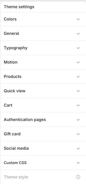
Colors
Color schemes are reusable color combinations that can be applied to sections throughout your online store. Each scheme defines colors for elements such as text, backgrounds, buttons, borders, icons, and accents, so you can create multiple branded styles and apply them where needed.
Schemes
Select an existing scheme or click Add Scheme to create a new one. Click any swatch within a scheme to update its colors, entering a HEX code or using the color picker. The preview at left of each scheme shows the text (Aa) and button colors it will produce.
Site-wide default
The default color scheme is applied to the whole site as CSS custom properties (for example --paper , --ink , --blue ). Sections don't yet expose their own scheme picker, so every page reads this one scheme. Use Edit scheme to adjust the colors of the selected default.
Customize color schemes
- From your Shopify admin, go to Online Store > Themes.
- Click Customize next to the theme you want to edit.
- Click Theme settings > Colors.
- Under Schemes, select an existing scheme or click Add Scheme.
- Click any color swatch to update text, background, button, border, and other colors.
- Enter a HEX color code or pick a color with the color picker.
- Set the Default color scheme that applies site-wide.
- Preview the changes to confirm branding consistency, then click Save.
General
Manage essential layout and branding configurations that apply across the storefront.
Side padding
Shared left and right spacing for sections, header, footer, and drawers. Mobile padding applies to screens 768px wide and below. Above 768px, fluid padding scales with the viewport between the mobile and maximum values. Keep the maximum at least as large as the mobile value.
| Setting | Description |
|---|---|
| Fluid side padding | Padding that scales with the viewport above 768px. Example: 3.4 vw. |
| Maximum side padding | Upper limit for side padding on wide screens. Example: 56px. |
| Mobile side padding | Side padding applied on screens 768px wide and below. Example: 16px. |
Favicon
| Setting | Description |
|---|---|
| Image | Upload a favicon that appears in the browser tab next to your store name. Will be scaled down to 32 × 32px. |
Typography
Customize the fonts, weights, sizes, and line heights used throughout your storefront. These settings help maintain consistent readability, hierarchy, and brand identity across all pages. For performance, enable only the font weights your theme actually uses — only enabled weights are loaded.
Display / headings
The display font is used for all display type — hero text, section headings, and product names.
| Setting | Description |
|---|---|
| Heading font | Font used for all display type (hero, section headings, product names). |
| Font weights | Enable only the weights your theme uses, from Load 100 (Thin) to Load 900 (Black). Example: 400 Regular and 600 Semi-bold enabled. |
Heading sizes
Control the size and line height of each heading level (H1–H6).
| Setting | Description |
|---|---|
| H1 font size / line height | Primary headings. Example: 96px / 107%. |
| H2 font size / line height | Secondary headings. Example: 68px / 113%. |
| H3 font size / line height | Third-level headings. Example: 56px / 110%. |
| H4 font size / line height | Fourth-level headings. Example: 40px / 120%. |
| H5 font size / line height | Fifth-level headings. Example: 28px / 109%. |
| H6 font size / line height | Sixth-level headings. Example: 18px / 122%. |
Editorial
The editorial font is used for the manifesto lede, italic emphasis, eyebrows, nav labels, prices, brand-story captions, and technical captions.
| Setting | Description |
|---|---|
| Editorial font | Secondary font for editorial text. Example: Inter. |
| Font weights | Enable only the weights your theme uses, from Load 100 (Thin) to Load 900 (Black). Example: 400 Regular and 700 Bold enabled. |
Text sizes
Control the size and spacing of body text at each scale.
| Setting | Description |
|---|---|
| Large font size / line height | Larger body text. Example: 16px / 150%. |
| Medium font size / line height | Medium text for product info and content areas. Example: 14px / 150%. |
| Small font size / line height | Smaller content such as labels, helper text, and captions. Example: 12px / 140%. |
Motion
Control animated effects across the storefront. Each effect is disabled automatically when a visitor's system prefers reduced motion.
| Setting | Description |
|---|---|
| Enable custom cursor | Replaces the default cursor with a custom one. Disabled automatically on touch devices and when a visitor prefers reduced motion. |
| Enable smooth scroll | Powers GSAP ScrollSmoother. Disabled automatically when a visitor prefers reduced motion. |
| Enable grain texture | A subtle animated film-grain overlay across every page. Disabled automatically when a visitor prefers reduced motion. |
Products
Customize how product variants, swatches, and stock status appear across your storefront.
| Setting | Description |
|---|---|
| Variant styles | Choose how product variants are displayed. Example: Native swatches. |
| Color swatch values | Define custom color or image swatches for variants. Format values as {ColorName,ColorValue} and separate multiple values with the || separator. ColorValue can be a HEX code (#A9A9A9 or #ABC), rgb(), hsl(), or an image file name. Image file names are ignored when Variant styles is Color, which always shows solid colors. Example: {Dark gray,#A9A9A9}||{Multicolor,image-name.png}. To use an image, upload a PNG whose file name matches the color name with spaces replaced by hyphens (e.g. 'hot-pink.png' for Hot Pink). |
Stock status
Controls how product-card stock bars behave based on inventory quantity.
| Setting | Description |
|---|---|
| Low stock threshold | Whole number, 0 or higher. At or below this quantity, stock bars use the color scheme's Accent contrast. Zero stock shows an empty bar. Example: 5. |
| In stock threshold | Whole number above the low stock threshold. At or above this quantity, bars become full and use the scheme's Accent; between thresholds, bars use Accent wash. Fill represents quantity divided by this target, not an original edition size. Example: 30. |
Product tags
Customize the badges shown on products.
Discount tag
| Setting | Description |
|---|---|
| Text color | Text color for the discount badge. Example: #F1EFE9. |
| Background color | Background color for the discount badge. Example: #D6431F. |
Custom tags
Add custom product badges. Format tags as {TagName,BackgroundColor,TextColor} and separate multiple tags with the || separator — for example {New,#000000,#ffffff}||{Trending,#ffffff,#000000}. To display these tags on products, add the matching tags on the product page.
Quick view
Quick View details use the product metafields custom.edition, custom.origin, custom.series, and custom.lead_time. Use single line text definitions; empty values are hidden.
| Setting | Description |
|---|---|
| Color scheme | Select the color scheme applied to the quick view. Use Edit scheme to adjust its colors. |
| Background color source | Uses a color from the selected scheme for the background. Choose different sources for a readable background and text. Example: Background. |
| Text color source | Uses a color from the selected scheme for text. Choose different sources for a readable background and text. Example: Text. |
Cart
Customize how the cart behaves and appears, including the free shipping progress bar.
| Setting | Description |
|---|---|
| Cart type | Choose Drawer (slides in from the side) or Page (sends shoppers to a full cart page). |
| Enable order notes | Let shoppers add a note to their order. |
| Enable discount code field | Show a discount code field in the cart. |
| Show product vendor | Display the product vendor on cart line items. |
Free shipping bar
| Setting | Description |
|---|---|
| Show free shipping progress bar | Display a progress bar toward the free shipping threshold. |
| Free shipping threshold | Amount, in your store's currency, needed to unlock free shipping (e.g. 200 for €200). Set to 0 to always show shipping as free. |
| Progress message | Message shown while below the threshold. Use ||amount|| where the remaining amount should appear. Example: Spend ||amount|| more for free shipping. |
| Unlocked message | Message shown once free shipping is reached. Example: Free shipping unlocked. |
Appearance
| Setting | Description |
|---|---|
| Color scheme | Select the color scheme applied to the cart. |
Authentication pages
Customize the customer account pages — Login, Register, Reset password, and Activate account. Each page shares the same set of heading and appearance controls listed below. In heading text, wrap a word in <em></em> to set it in the editorial italic.
| Setting | Description |
|---|---|
| Show shop sign-in button | Allows customers to sign in with their Shop account for faster checkout and login. Appears only when Sign in with Shop is enabled for your store. |
| Heading | The page heading text. Supports HTML; wrap a word in <em></em> for editorial italic. Example: Welcome <em>back.</em> |
| Text size | Size of the heading. Example: H3. |
| Text weight | Font weight of the heading. Example: Bold. |
| Text case | Capitalization of the heading. Example: Uppercase. |
| Heading level | HTML heading tag used for SEO. Example: H1. |
| Heading font | Typography style for the heading: Display or Editorial. |
| Heading color | Color style for the heading. Example: Text. |
| Button style | Style for the authentication button. Example: Primary with arrow. |
| Button case | Capitalization of button text. Example: Uppercase. |
| Color scheme | Color scheme applied to the page. Use Edit scheme to adjust its colors. |
Available authentication pages
| Page | Purpose | Default heading |
|---|---|---|
| Login | Customer login page | Welcome <em>back.</em> |
| Register | Customer account registration | Create an <em>account.</em> |
| Reset password | Password reset page | Choose a new <em>password.</em> |
| Activate account | Account activation after registration / email verification | Activate your <em>account.</em> |
Gift card
Customize the appearance of the gift card page, including the logo, heading, and buttons.
| Setting | Description |
|---|---|
| Logo | Upload a logo image for the gift card page. |
| Logo width (desktop) | Logo width on desktop. Example: 120px. |
| Logo width (mobile) | Logo width on mobile. Example: 120px. |
| Heading | Gift card heading text. Leave blank to use the default heading. Example: Your gift card. |
| Text size | Size of the heading. Example: H3. |
| Text weight | Font weight of the heading. Example: Normal. |
| Text case | Capitalization of the heading. Example: Capitalize. |
| Heading level | HTML heading tag used for SEO. Example: H1. |
| Heading font | Typography style for the heading. Example: Default. |
| Heading color | Color style for the heading. Example: Default. |
Continue shopping button
| Setting | Description |
|---|---|
| Button style | Style for the continue shopping button. Example: Styled. |
| Button case | Capitalization of button text. Example: Uppercase. |
Print button
| Setting | Description |
|---|---|
| Button style | Style for the print button. Example: Secondary. |
| Button case | Capitalization of button text. Example: Uppercase. |
Appearance
| Setting | Description |
|---|---|
| Color scheme | Color scheme applied to the gift card page. Use Edit scheme to adjust its colors. |
| Background color source | Uses a color from the selected scheme for the background. Choose different sources for a readable background and text. Example: Background. |
| Text color source | Uses a color from the selected scheme for text. Choose different sources for a readable background and text. Example: Text. |
Social media
Add links to your social media accounts. Enter full links (for example, https://instagram.com/shopify or https://facebook.com/shopify) in the fields provided, then click Save. The following account fields are available:
- Instagram URL
- Twitter / X URL — used for the twitter:site social-sharing tag
- LinkedIn URL
- Facebook URL
- YouTube URL
- Snapchat URL
- Pinterest URL
- TikTok URL
- Tumblr URL
- Vimeo URL
To add social media links:
- Click Theme settings > Social media.
- Enter the full link to each account under Accounts.
- Click Save.
Custom CSS
Adds custom styles to your entire online store. Enter CSS in the CSS field — for example:
.card {
  border-radius: 30px;
}
Use this to fine-tune styling beyond the other theme settings. Refer to the "Learn more about custom CSS" link in the editor for guidance on supported selectors and limitations.